This lesson is studied in the Classical Liberal Arts Academy’s HUM-431 Economics course.
Economists and business people often have occasion to record certain facts and relations between facts by means of schedules, diagrams, and graphs. These devices are very helpful to a clear understanding of complicated facts and relations and are coming into such general use that everyone ought to understand them and know how to use them. They will be especially useful in our study of demand and supply, and this chapter will therefore be devoted to their study.
Schedule
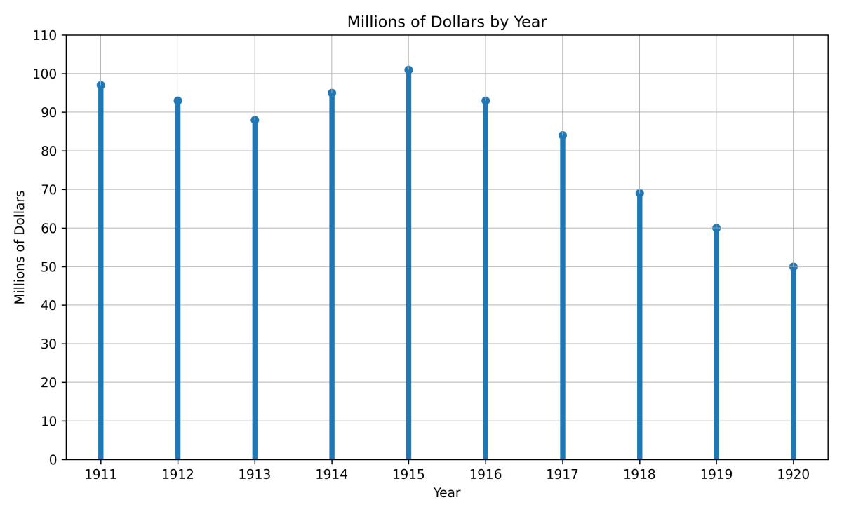
The schedule is the simplest type of statistical table. In it we arrange facts in parallel columns. For example, the following schedule shows the value of gold mined in the United States in each year from 1911 to 1920:
GOLD MINED IN THE UNITED STATES, 1911–1920
| Year | Value of gold mined (in millions of dollars) | Year | Value of gold mined (in millions of dollars) |
|---|---|---|---|
| 1911 | 97 | 1916 | 93 |
| 1912 | 93 | 1917 | 84 |
| 1913 | 98 | 1918 | 69 |
| 1914 | 95 | 1919 | 60 |
| 1915 | 101 | 1920 | 50 |
Line Chart
These facts may be shown very clearly by means of a simple diagram. We draw two lines forming a right angle at the point 0. On the vertical line, oy, we mark off a scale so that the distances above the point o measure millions of dollars’ worth of gold. The horizontal line, 0x, we mark off into equal spaces to represent the years.
Starting at each of the several division points on the base line, we draw a vertical line whose length, as measured by the scale on 0y, represents the value of gold mined in that particular year. The measurement of the lines is made easier by drawing cross-section paper. This gives us a line chart.
Block Chart
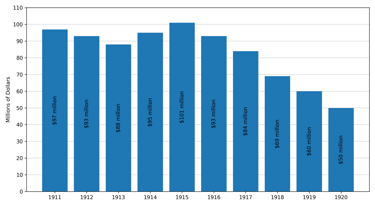
Such facts may also be shown by means of a slightly different diagram, called a block chart or a bar chart. This is shown for the same facts in Figure 2.
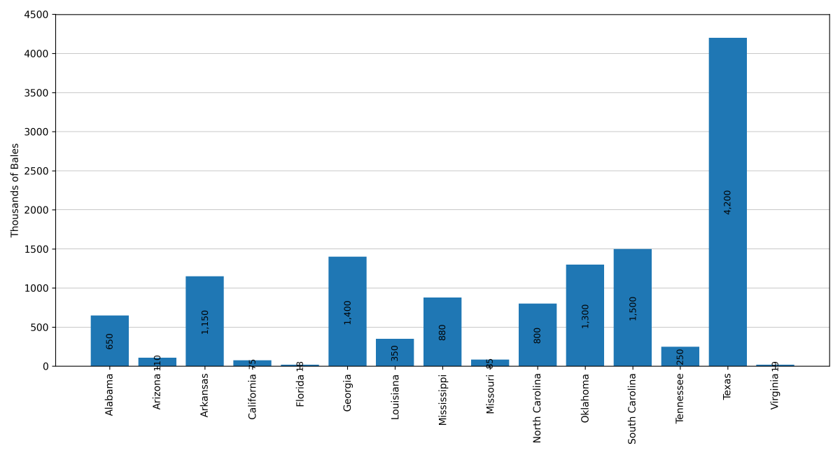
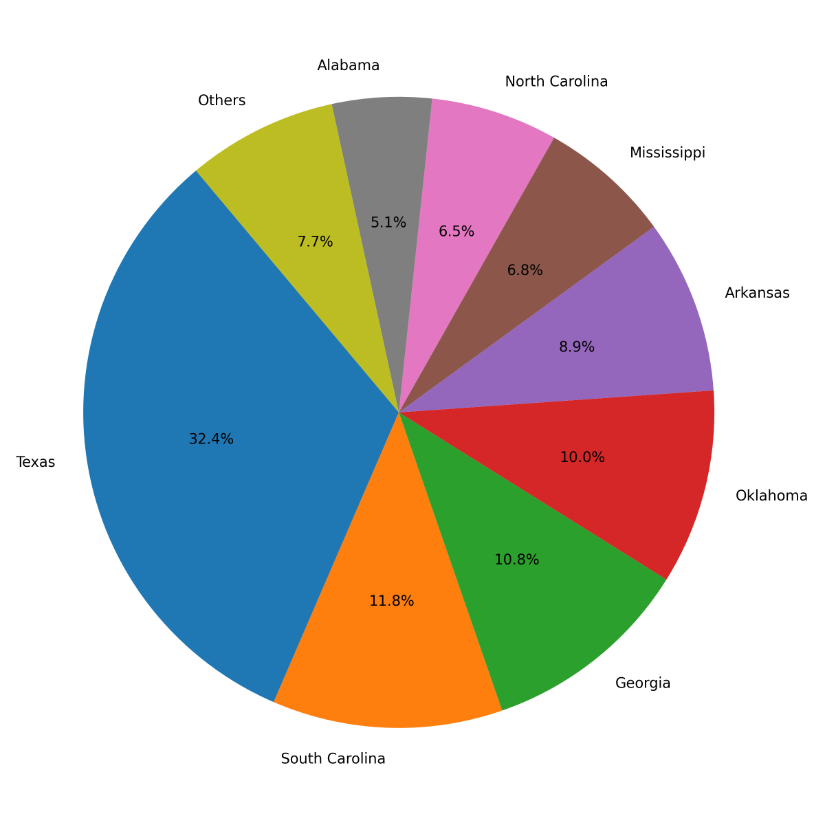
Another block chart. Let us take another example. One of the greatest agricultural products of the United States is cotton; nearly all of it is grown in fifteen states. The following schedule shows the amount produced in each of these states in the year 1920:
COTTON CROP OF THE UNITED STATES, BY STATES, 1920
| State | Bales produced | Percentage of total |
|---|---|---|
| Alabama | 660,000 | 5.1 |
| Arizona | 110,000 | 0.9 |
| Arkansas | 1,160,000 | 8.9 |
| California | 75,000 | 0.6 |
| Florida | 18,000 | 0.1 |
| Georgia | 1,400,000 | 10.8 |
| Louisiana | 380,000 | 2.9 |
| Mississippi | 885,000 | 6.8 |
| Missouri | 85,000 | 0.7 |
| North Carolina | 840,000 | 6.5 |
| Oklahoma | 1,300,000 | 10.0 |
| South Carolina | 1,530,000 | 11.8 |
| Tennessee | 310,000 | 2.4 |
| Texas | 4,200,000 | 32.4 |
| Virginia | 19,000 | 0.1 |
| Total | 12,972,000 | 100.0 |
A block chart will bring out very clearly the amounts produced in the several states.
Distribution Shown by Block Chart
We may also use diagrams to bring out clearly the percentage of the total cotton crop grown in each state. This is shown by means of a slightly different kind of block chart, in Figure 4. Notice that the horizontal length of the block is marked off to show percentages from 0 to 100. In this chart, it was found convenient to put the states producing the smaller amounts of cotton (Arizona, California, Florida, Louisiana, Missouri, Tennessee, and Virginia) together in a single group. In this diagram the states are arranged in the order of the amount of cotton produced, instead of alphabetically as before.
Circular Diagram
Another method of showing divisions into percentages or other parts is by means of a circular diagram, sometimes called the “pie diagram” or “pie chart.” The cotton production of the several states is thus shown in Figure 5.
Graph or Curve
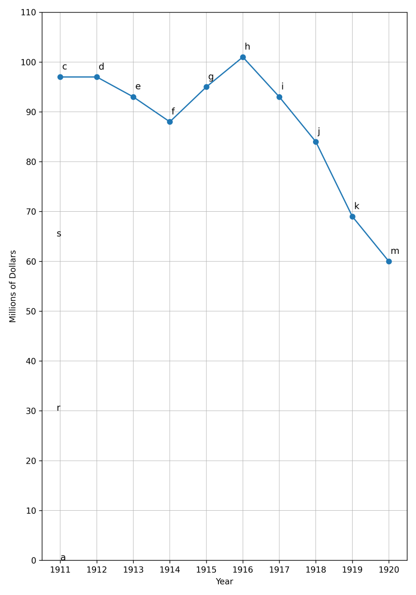
So far we have studied what are called diagrams. Another device is the graph. Graphs, or curves, are used by economists and business people to show in the clearest and easiest way a great multitude of facts and relations. The general idea is the same, whatever is to be shown. We begin by drawing a horizontal line, ox (see Figure 6), and a vertical line, oy, meeting to form a right angle at the point o, which we call the origin. The two lines are called the axes. The line ox is called the x axis; oy is the y axis. On each axis we mark off a scale so that we can represent different quantities by the distances above the x axis or to the right of the y axis.
For example, let us represent the facts of the United States gold production from 1911 to 1920. We start as in drawing Figure 1. Quantities of gold are measured by the distances above o on the y axis. We mark off on oy a scale in which each space stands for 5 million dollars. Thus the distance from o to 7 represents 35 million dollars, or 65 million dollars, and so on. On the x axis we mark off a scale, in which each space represents one year, beginning with the year 1911.
The gold mined in 1911 was worth 97 million dollars. On the y axis we locate the point whose distance above the x axis stands for 97 million; that is the point c. Then starting at the point a on the x axis we measure a vertical distance equal to oc, and so locate the point d, the point that in the year 1911 the gold production was 97 million dollars. In exactly the same way we locate the points e, f, g, h, i, j, k, l, and m, showing the respective amounts produced in the years 1912 to 1920. To get a graph or curve, we have only to connect all these points d, e, f, etc. This curve shows very clearly the changes in quantity of gold produced from year to year during this decade.
A comparison of Figure 6 with Figure 1 will show that these figures are simply two methods of showing the same facts. We might have constructed the curve by joining the tops of the vertical lines in Figure 1 and then erasing the vertical lines themselves. The curve simply enables the eye to more readily compare quantities of gold produced in the several years. Such curves are convenient in showing the development through a period of time of many kinds of facts, such as the imports and exports of a country from year to year, the rainfall at any locality from month to month or year to year, the temperature by days or hours, number of employees in a business, wages paid, prices, and innumerable other phenomena.
Another Kind of Curve
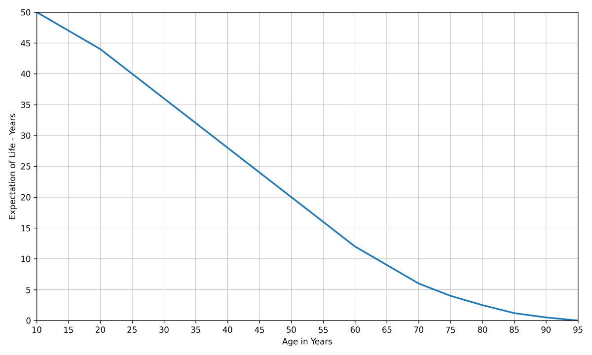
A somewhat different use of the curve is to show the relation between certain phenomena at a given time. This may be illustrated by a curve of “expectation of life.” The life insurance companies use “mortality tables,” which show, among other things, the average duration of life which may be expected by persons of different ages. These tables are based upon statistics gathered from records of many thousands of lives. Of course such tables cannot predict how long any particular individual will live. But they do show how long, on average, persons have lived in the past after reaching this age, and this average is called the person’s probable duration of life or expectation of life. There are several mortality tables in use, differing slightly from one another. The schedule at the top of the following page is taken from what is known as the “American Experience Table,” the mortality table in general use by American life insurance companies. It shows the expectation of life at each age from ten to ninety-five years.
EXPECTATION OF LIFE (AMERICAN EXPERIENCE TABLE)
| Age | Expectation of life | Age | Expectation of life | Age | Expectation of life |
|---|---|---|---|---|---|
| 10 | 48.72 | 39 | 28.90 | 68 | 9.47 |
| 11 | 48.04 | 40 | 28.18 | 69 | 8.97 |
| 12 | 47.45 | 41 | 27.45 | 70 | 8.48 |
| 13 | 46.80 | 42 | 26.72 | 71 | 8.00 |
| 14 | 46.16 | 43 | 26.00 | 72 | 7.55 |
| 15 | 45.50 | 44 | 25.27 | 73 | 7.11 |
| 16 | 44.85 | 45 | 24.54 | 74 | 6.68 |
| 17 | 44.19 | 46 | 23.81 | 75 | 6.27 |
| 18 | 43.53 | 47 | 23.08 | 76 | 5.88 |
| 19 | 42.87 | 48 | 22.36 | 77 | 5.49 |
| 20 | 42.20 | 49 | 21.63 | 78 | 5.11 |
| 21 | 41.53 | 50 | 20.91 | 79 | 4.74 |
| 22 | 40.85 | 51 | 20.20 | 80 | 4.39 |
| 23 | 40.17 | 52 | 19.49 | 81 | 4.05 |
| 24 | 39.49 | 53 | 18.79 | 82 | 3.71 |
| 25 | 38.81 | 54 | 18.09 | 83 | 3.39 |
| 26 | 38.12 | 55 | 17.40 | 84 | 3.08 |
| 27 | 37.43 | 56 | 16.71 | 85 | 2.77 |
| 28 | 36.73 | 57 | 16.05 | 86 | 2.47 |
| 29 | 36.03 | 58 | 15.39 | 87 | 2.18 |
| 30 | 35.33 | 59 | 14.74 | 88 | 1.91 |
| 31 | 34.63 | 60 | 14.10 | 89 | 1.66 |
| 32 | 33.92 | 61 | 13.47 | 90 | 1.42 |
| 33 | 33.21 | 62 | 12.86 | 91 | 1.19 |
| 34 | 32.50 | 63 | 12.26 | 92 | .98 |
| 35 | 31.78 | 64 | 11.67 | 93 | .80 |
| 36 | 31.07 | 65 | 11.10 | 94 | .64 |
| 37 | 30.35 | 66 | 10.54 | 95 | .50 |
| 38 | 29.62 | 67 | 10.00 |
From this schedule a curve is constructed by the same method that was used in drawing Figure 6. This curve does not show a historical development over a period of time as in Figure 6. Its different parts do not relate to different dates, as in Figure 6. What it shows is the relation, at any time, between a person’s age and his expectation of life.
For example, take any age, say 45 years. From the point a on the base line ox, draw a vertical line meeting the curve at b. From this point, go on a horizontal line to the y axis, located at the point c, which shows that at the age of 45 the expectation of life is about 24½ years (24.54, to be exact).
Whatever point is taken on the curve, its distance to the right of the y axis measures an age, while its distance above the x axis measures the expectation of life corresponding to that age. We may even locate a point that was not represented in the schedule. For example, the point d is directly above e, representing 22½ years of age, and to the right of f, which measures 40½ years on the y axis. This indicates that at age 22½ the expectation of life is 40½ years (approximately). This is reasonable, since we should naturally expect to find the expectation of life for age 22½ halfway between the expectations for 22 and 23 years respectively. Referring to the schedule and calculating this number gives 40.51. Such determination of quantities not stated in the schedule is called graphical interpolation. It may be done with curves showing relations like this one, but usually not with a curve showing a historical series of quantities as in Figure 6.